10/10/25 - It’s been so long since we’ve last seen you!
10/24/22 - In searching for the perfect day, Timmy discovers something unexpected!
9/04/22 - That childhood favorite is back in a new Timmy video.
7/31/22 - It’s time for my second new Just Like Timmy video!
7/12/22 - Why not check out my new YouTube animation channel, Just Like Timmy!
|
|
 |
|

The following page was printed from remotecentral.com:
In this section: These systems employ completely original artwork for a truly unique remote control layout. Also includes entries from The 2004 Great ProntoPro NG TSU7000 PCF design contest.

| Page 6 of 11
|
Original Design Systems Displaying entries 51 through 60, of 101 available.
Contest Entry #11: OS 2k4.0 Pro
Added by John Sollecito | 2004 | 3,042 views
This design is straight forward and flexible and takes advantage of the advanced graphics capability of the TSU7000. The interface was designed to be user friendly for all who may use it. In most cases, each component has one screen containing the most used buttons that keeps ‘screen flipping’ to a minimum. Furthermore, the user can switch from any component to another from any screen in the interface. For example, if you are watching TV and want to switch to the DVD, all you need to do is tap the DVD icon on the top of the page and the TSU7000 will turn off the TV and switch on all components needed to watch a DVD. What makes this design unique is the presence of the ‘splash’ screens. Splash screens are the ‘animated’ screens that appear while the TSU7000 is performing a lengthy macro. For example, when the TSU7000 is sending the commands to turn on a component, there are many steps it needs to perform. In the 5-7 seconds this takes to complete, this interface will flash through screens updating the user on the status of the task. NOTE: All hard keys will be used to control VOL+/-, CH+/-,MUTE and DIRECTION PAD for each component interface. The first screenshot is of the home... (more)
Designed for:
Philips ProntoPro NG TSU7000 & RU980
|
|
Contest Entry #33: Heavy Blue
Added by Jon Linville | 2004 | 2,548 views
This is a PCF file that I designed 100%. It contains many devices and has a consistent easy-to-use layout throughout. The system page contains a modified version of the chrome Pronto symbol that is used as a home page button. There are two satellite boxes, each with all available DirecTV channel icons, as well as channel icons for my cable TV channels - located in the TV device. The DVD jukebox contains jackets for over 300 DVDs and allow you to jump directly to that disc. The CD jukebox currently has a sample page with CD jackets, I haven't loaded my changer yet. In the discrete codes section there are macros to get to any of the 400 discs in the DVD jukebox and the 400 discs in the CD jukebox. The file is large, but will download to the remote and simulates very well. The learning curve is very small. Enjoy it!
Designed for:
Philips ProntoPro NG TSU7000 & RU980
|
|
Jon Linville's Jukebox Layout
Added by Jon Linville | 2003 | 14,385 views
This PCF contains jacket covers for over 300 DVDs as well as macros for all 400 slots. Both satellites have all available DirecTV channel icons and macros. Very user friendly. 95% of all graphics were made by me. Only a few were borrowed.
Designed for:
Philips Pronto NG TSU3000 & RU950
|
|
Joe's Media Center-Based PCF
Added by Joseph Francaviglia | 2007 | 12,581 views
Here is an updated version of my previous PCF. Basically the same with some updated Vista graphics. I made some more use of transparencies and made the buttons larger. Hope you like.
Designed for:
Philips ProntoPro NG TSU7000 & RU980
|
|
Contest Entry #10: Trek7000
Added by Keith Michaels | 2004 | 3,792 views
This PCF design is based on LCARS (Library Computer Access and Retrieval System), the graphical computer interface seen on certain Star Trek TV series. There are control pages for a TV, DSS receiver, TiVo, ReplayTV, Receiver, DVD player, LaserDisc player, 2 VCRs, CD player, tuner, tape deck, video games, lights, and curtains. A few of the standard system items have been replaced to take advantage of the whole LCD and create a complete design: - The activity icon is now a Star Trek phaser and pops up while the Pronto transmits.
- The battery gauge is a functioning LCARS-style battery gauge.
- Pressing and holding the circular blue logo for 3 seconds takes you to the Pronto's setup pages.
Additional Info: To go to the Home page at any time, press the lower-right "Home" hard button. I tried to leave all device functionality as generic as possible, hopefully allowing most people to use this PCF in their own system without much customization beyond programming their device's IR codes. To simplify programming, a "Codes" page under each device contains buttons with the IR codes for that device. The actual device buttons link to these buttons for their IR codes.
Designed for:
Philips ProntoPro NG TSU7000 & RU980
|
|
Mark Howard's Original PCF
Added by Mark Howard | 2003 | 7,699 views
My first PCF, all buttons and graphics are origional except for the help page graphic that I borrowed from 'Chang' and the header icons that I 'borrowed' ages ago when creating a CCF, I apologise that I don't know who's work they were as it was so long ago (but thanks).
Designed for:
Philips Pronto NG TSU3000 & RU950
|
|
Michael Bramhoff's Home Theater
Added by Michael Bramhoff | 2006 | 18,000 views
Complete control of my home theater including HTPC and lighting devices.
Designed for:
Philips ProntoPro NG TSU7000 & RU980
|
|
Contest Entry #24: Simple Elegance
Added by Michael Burwen | 2004 | 2,642 views
This design was created with specific ergonomic objectives in mind: - Ease-of-vision, particularly by senior citizens. This dictated using relatively large, primary-color icons against a white background. The color scheme was devised by Mr. Gary Hoover, a retired famous movie-industry colorist and graphic artist.
- To provide self-contained instructions. On each page, depressing the owl "professor" icon leads to one or more text instruction pages.
- No more than two screens to operate any single device.
- To use the hard buttons as much as possible.
- K.I.S.S. i.e., pass the "wife" test.
Most of the graphics are original and were created with Paint Shop Pro 8. The instruction screens were created with Photoshop Elements 2.0.
Designed for:
Philips ProntoPro NG TSU7000 & RU980
|
|
Michael Burwen's Custom TSU3000
Added by Michael Burwen | 2004 | 11,729 views
This is a revision of my previously submitted file. It makes better use of graphic icons for buttons and cleans up some inconsistencies in my previous upload. The principal design objective here was to make the screen as legible as possible given the rather dim nature of the TSU3000. I have been testing various screen icons and layouts on several people and feel that older users find it easier to use this schema than the more elegant 3D designs. Another objective was to make use the hard buttons: the row of buttons under the screen is used exclusively for navigating between screens.
Designed for:
Philips Pronto NG TSU3000 & RU950
|
|
Michael Griffith's Pronto
Added by Michael Griffith | 2006 | 14,690 views
 
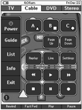
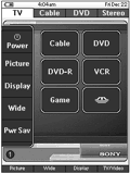
This is my first configuration. I did not use any graphical elements from the Daniel Tonks remote that I'm aware of. Don't get me wrong, it's a nice remote but I wanted to try to create something original. My graphics may look dark but they have to be to show up on the TSU3000 (i.e they're not that dark on the remote). Like many of the configurations here, I created a hidden page of codes for every device then linked the buttons to the code pages. I learned the codes for every button on every remote that pertained to the device regardless of whether or not I intended to use it in my design. I thought that if by chance I had a remote that someone was looking for that they might appreciate having the entire remote. Most of my devices have two or three GUI pages. At the top are tabs with devices related to each other. The white tab indicates the current page and the dark tabs are buttons to switch to the other devices. On the left side of each screen is a block of common buttons that carry over to each page. In the middle is a graphic that I created and what I would consider rather large, simple buttons that are easy for me to press. See the readme.txt file for more details.
Designed for:
Philips Pronto NG TSU3000 & RU950
|
|
|
Search Remote Central's Files
Share with the remote control community
by uploading a file to Remote Central!
|
|

